


Managing State
Hyper Text Transfer Protocol (HTTP) is a stateless protocol. When the client disconnects from the server, the ASP.NET engine discards the page objects. This way, each web application can scale up to serve numerous requests simultaneously without running out of server memory.
However, there needs to be some technique to store the information between requests and to retrieve it when required. This information i.e., the current value of all the controls and variables for the current user in the current session is called the State.
ASP.NET manages four types of states:
- View State
- Control State
- Session State
- Application State
View State
The view state is the state of the page and all its controls. It is automatically maintained across posts by the ASP.NET framework.
When a page is sent back to the client, the changes in the properties of the page and its controls are determined, and stored in the value of a hidden input field named _VIEWSTATE. When the page is again posted back, the _VIEWSTATE field is sent to the server with the HTTP request.
The view state could be enabled or disabled for:
The entire application by setting the EnableViewState property in the <pages> section of web.config file.
A page by setting the EnableViewState attribute of the Page directive, as <%@ Page Language="C#" EnableViewState="false" %>
A control by setting the Control.EnableViewState property.
It is implemented using a view state object defined by the StateBag class which defines a collection of view state items. The state bag is a data structure containing attribute value pairs, stored as strings associated with objects.
The StateBag class has the following properties:
| Properties | Description |
|---|---|
| Item(name) | The value of the view state item with the specified name. This is the default property of the StateBag class. |
| Count | The number of items in the view state collection. |
| Keys | Collection of keys for all the items in the collection. |
| Values | Collection of values for all the items in the collection. |
The StateBag class has the following methods:
| Methods | Description |
|---|---|
| Add(name, value) | Adds an item to the view state collection and existing item is updated. |
| Clear | Removes all the items from the collection. |
| Equals(Object) | Determines whether the specified object is equal to the current object. |
| Finalize | Allows it to free resources and perform other cleanup operations. |
| GetEnumerator | Returns an enumerator that iterates over all the key/value pairs of the StateItem objects stored in the StateBag object. |
| GetType | Gets the type of the current instance. |
| IsItemDirty | Checks a StateItem object stored in the StateBag object to evaluate whether it has been modified. |
| Remove(name) | Removes the specified item. |
| SetDirty | Sets the state of the StateBag object as well as the Dirty property of each of the StateItem objects contained by it. |
| SetItemDirty | Sets the Dirty property for the specified StateItem object in the StateBag object. |
| ToString | Returns a string representing the state bag object. |
Example
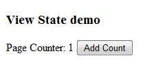
The following example demonstrates the concept of storing view state. Let us keep a counter, which is incremented each time the page is posted back by clicking a button on the page. A label control shows the value in the counter.
The markup file code is as follows:
<%@ Page Language="C#" AutoEventWireup="true" CodeBehind="Default.aspx.cs" Inherits="statedemo._Default" %>

<!DOCTYPE html PUBLIC "-//W3C//DTD XHTML 1.0 Transitional//EN" "http://www.w3.org/TR/xhtml1/DTD/xhtml1-transitional.dtd">

<html xmlns="http://www.w3.org/1999/xhtml" >

   <head runat="server">
      <title>
         Untitled Page
      </title>
   </head>

   <body>
      <form id="form1" runat="server">

         <div>
            <h3>View State demo</h3>

            Page Counter:

            <asp:Label ID="lblCounter" runat="server" />
            <asp:Button ID="btnIncrement" runat="server" Text="Add Count" onclick="btnIncrement_Click" />
         </div>

      </form>
   </body>

</html>
The code behind file for the example is shown here:
public partial class _Default : System.Web.UI.Page
{
   public int counter
   {
      get
      {
         if (ViewState["pcounter"] != null)
         {
            return ((int)ViewState["pcounter"]);
         }
         else
         {
            return 0;
         }
      }

      set
      {
         ViewState["pcounter"] = value;
      }
   }

   protected void Page_Load(object sender, EventArgs e)
   {
      lblCounter.Text = counter.ToString();
      counter++;
   }
}
It would produce the following result:
Control State
Control state cannot be modified, accessed directly, or disabled.
Session State
When a user connects to an ASP.NET website, a new session object is created. When session state is turned on, a new session state object is created for each new request. This session state object becomes part of the context and it is available through the page.
Session state is generally used for storing application data such as inventory, supplier list, customer record, or shopping cart. It can also keep information about the user and his preferences, and keep the track of pending operations.
Sessions are identified and tracked with a 120-bit SessionID, which is passed from client to server and back as cookie or a modified URL. The SessionID is globally unique and random.
The session state object is created from the HttpSessionState class, which defines a collection of session state items.
The HttpSessionState class has the following properties:
| Properties | Description |
|---|---|
| SessionID | The unique session identifier. |
| Item(name) | The value of the session state item with the specified name. This is the default property of the HttpSessionState class. |
| Count | The number of items in the session state collection. |
| TimeOut | Gets and sets the amount of time, in minutes, allowed between requests before the session-state provider terminates the session. |
The HttpSessionState class has the following methods:
| Methods | Description |
|---|---|
| Add(name, value) | Adds an item to the session state collection. |
| Clear | Removes all the items from session state collection. |
| Remove(name) | Removes the specified item from the session state collection. |
| RemoveAll | Removes all keys and values from the session-state collection. |
| RemoveAt | Deletes an item at a specified index from the session-state collection. |
The session state object is a name-value pair to store and retrieve some information from the session state object. You could use the following code for the same:
void StoreSessionInfo()
{
   String fromuser = TextBox1.Text;
   Session["fromuser"] = fromuser;
}

void RetrieveSessionInfo()
{
   String fromuser = Session["fromuser"];
   Label1.Text = fromuser;
}
The above code stores only strings in the Session dictionary object, however, it can store all the primitive data types and arrays composed of primitive data types, as well as the DataSet, DataTable, HashTable, and Image objects, as well as any user-defined class that inherits from the ISerializable object.
Example
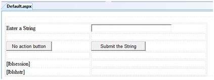
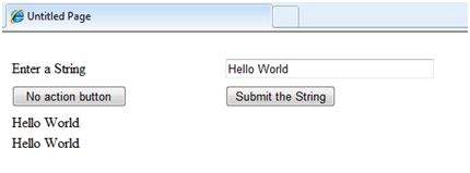
The following example demonstrates the concept of storing session state. There are two buttons on the page, a text box to enter string and a label to display the text stored from last session.
The mark up file code is as follows:
<%@ Page Language="C#" AutoEventWireup="true" CodeFile="Default.aspx.cs" Inherits="_Default" %>
<!DOCTYPE html PUBLIC "-//W3C//DTD XHTML 1.0 Transitional//EN" "http://www.w3.org/TR/xhtml1/DTD/xhtml1-transitional.dtd">
<html xmlns="http://www.w3.org/1999/xhtml" >
<head runat="server">
<title>
Untitled Page
</title>
</head>
<body>
<form id="form1" runat="server">
<div>
<table style="width: 568px; height: 103px">
<tr>
<td style="width: 209px">
<asp:Label ID="lblstr" runat="server" Text="Enter a String" style="width:94px">
</asp:Label>
</td>
<td style="width: 317px">
<asp:TextBox ID="txtstr" runat="server" style="width:227px">
</asp:TextBox>
</td>
</tr>
<tr>
<td style="width: 209px"> </td>
<td style="width: 317px"> </td>
</tr>
<tr>
<td style="width: 209px">
<asp:Button ID="btnnrm" runat="server"
Text="No action button" style="width:128px" />
</td>
<td style="width: 317px">
<asp:Button ID="btnstr" runat="server"
OnClick="btnstr_Click" Text="Submit the String" />
</td>
</tr>
<tr>
<td style="width: 209px"> </td>
<td style="width: 317px"> </td>
</tr>
<tr>
<td style="width: 209px">
<asp:Label ID="lblsession" runat="server" style="width:231px" >
</asp:Label>
</td>
<td style="width: 317px"> </td>
</tr>
<tr>
<td style="width: 209px">
<asp:Label ID="lblshstr" runat="server">
</asp:Label>
</td>
<td style="width: 317px"> </td>
</tr>
</table>
</div>
</form>
</body>
</html>
It should look like the following in design view:
The code behind file is given here:
public partial class _Default : System.Web.UI.Page
{
   String mystr;

   protected void Page_Load(object sender, EventArgs e)
   {
      this.lblshstr.Text = this.mystr;
      this.lblsession.Text = (String)this.Session["str"];
   }

   protected void btnstr_Click(object sender, EventArgs e)
   {
      this.mystr = this.txtstr.Text;
      this.Session["str"] = this.txtstr.Text;
      this.lblshstr.Text = this.mystr;
      this.lblsession.Text = (String)this.Session["str"];
   }
}
Execute the file and observe how it works:
Application State
The ASP.NET application is the collection of all web pages, code and other files within a single virtual directory on a web server. When information is stored in application state, it is available to all the users.
To provide for the use of application state, ASP.NET creates an application state object for each application from the HTTPApplicationState class and stores this object in server memory. This object is represented by class file global.asax.
Application State is mostly used to store hit counters and other statistical data, global application data like tax rate, discount rate etc. and to keep the track of users visiting the site.
The HttpApplicationState class has the following properties:
| Properties | Description |
|---|---|
| Item(name) | The value of the application state item with the specified name. This is the default property of the HttpApplicationState class. |
| Count | The number of items in the application state collection. |
The HttpApplicationState class has the following methods:
| Methods | Description |
|---|---|
| Add(name, value) | Adds an item to the application state collection. |
| Clear | Removes all the items from the application state collection. |
| Remove(name) | Removes the specified item from the application state collection. |
| RemoveAll | Removes all objects from an HttpApplicationState collection. |
| RemoveAt | Removes an HttpApplicationState object from a collection by index. |
| Lock() | Locks the application state collection so only the current user can access it. |
| Unlock() | Unlocks the application state collection so all the users can access it. |
Application state data is generally maintained by writing handlers for the events:
- Application_Start
- Application_End
- Application_Error
- Session_Start
- Session_End
The following code snippet shows the basic syntax for storing application state information:
Void Application_Start(object sender, EventArgs e)
{
   Application["startMessage"] = "The application has started.";
}

Void Application_End(object sender, EventArgs e)
{
   Application["endtMessage"] = "The application has ended.";
Validators
ASP.NET validation controls validate the user input data to ensure that useless, unauthenticated, or contradictory data don't get stored.
ASP.NET provides the following validation controls:
- RequiredFieldValidator
- RangeValidator
- CompareValidator
- RegularExpressionValidator
- CustomValidator
- ValidationSummary
BaseValidator Class
The validation control classes are inherited from the BaseValidator class hence they inherit its properties and methods. Therefore, it would help to take a look at the properties and the methods of this base class, which are common for all the validation controls:
| Members | Description |
|---|---|
| ControlToValidate | Indicates the input control to validate. |
| Display | Indicates how the error message is shown. |
| EnableClientScript | Indicates whether client side validation will take. |
| Enabled | Enables or disables the validator. |
| ErrorMessage | Indicates error string. |
| Text | Error text to be shown if validation fails. |
| IsValid | Indicates whether the value of the control is valid. |
| SetFocusOnError | It indicates whether in case of an invalid control, the focus should switch to the related input control. |
| ValidationGroup | The logical group of multiple validators, where this control belongs. |
| Validate() | This method revalidates the control and updates the IsValid property. |
RequiredFieldValidator Control
The RequiredFieldValidator control ensures that the required field is not empty. It is generally tied to a text box to force input into the text box.
The syntax of the control is as given:
<asp:RequiredFieldValidator ID="rfvcandidate"
   runat="server" ControlToValidate ="ddlcandidate"
   ErrorMessage="Please choose a candidate"
   InitialValue="Please choose a candidate">

</asp:RequiredFieldValidator>
RangeValidator Control
The RangeValidator control verifies that the input value falls within a predetermined range.
It has three specific properties:
| Properties | Description |
|---|---|
| Type | It defines the type of the data. The available values are: Currency, Date, Double, Integer, and String. |
| MinimumValue | It specifies the minimum value of the range. |
| MaximumValue | It specifies the maximum value of the range. |
The syntax of the control is as given:
<asp:RangeValidator ID="rvclass" runat="server" ControlToValidate="txtclass"
   ErrorMessage="Enter your class (6 - 12)" MaximumValue="12"
   MinimumValue="6" Type="Integer">

</asp:RangeValidator>
CompareValidator Control
The CompareValidator control compares a value in one control with a fixed value or a value in another control.
It has the following specific properties:
| Properties | Description |
|---|---|
| Type | It specifies the data type. |
| ControlToCompare | It specifies the value of the input control to compare with. |
| ValueToCompare | It specifies the constant value to compare with. |
| Operator | It specifies the comparison operator, the available values are: Equal, NotEqual, GreaterThan, GreaterThanEqual, LessThan, LessThanEqual, and DataTypeCheck. |
The basic syntax of the control is as follows:
<asp:CompareValidator ID="CompareValidator1" runat="server"
   ErrorMessage="CompareValidator">

</asp:CompareValidator>
RegularExpressionValidator
The RegularExpressionValidator allows validating the input text by matching against a pattern of a regular expression. The regular expression is set in the ValidationExpression property.
The following table summarizes the commonly used syntax constructs for regular expressions:
| Character Escapes | Description |
|---|---|
| \b | Matches a backspace. |
| \t | Matches a tab. |
| \r | Matches a carriage return. |
| \v | Matches a vertical tab. |
| \f | Matches a form feed. |
| \n | Matches a new line. |
| \ | Escape character. |
Apart from single character match, a class of characters could be specified that can be matched, called the metacharacters.
| Metacharacters | Description |
|---|---|
| . | Matches any character except \n. |
| [abcd] | Matches any character in the set. |
| [^abcd] | Excludes any character in the set. |
| [2-7a-mA-M] | Matches any character specified in the range. |
| \w | Matches any alphanumeric character and underscore. |
| \W | Matches any non-word character. |
| \s | Matches whitespace characters like, space, tab, new line etc. |
| \S | Matches any non-whitespace character. |
| \d | Matches any decimal character. |
| \D | Matches any non-decimal character. |
Quantifiers could be added to specify number of times a character could appear.
| Quantifier | Description |
|---|---|
| * | Zero or more matches. |
| + | One or more matches. |
| ? | Zero or one matches. |
| {N} | N matches. |
| {N,} | N or more matches. |
| {N,M} | Between N and M matches. |
The syntax of the control is as given:
<asp:RegularExpressionValidator ID="string" runat="server" ErrorMessage="string"
   ValidationExpression="string" ValidationGroup="string">

</asp:RegularExpressionValidator>
CustomValidator
The CustomValidator control allows writing application specific custom validation routines for both the client side and the server side validation.
The client side validation is accomplished through the ClientValidationFunction property. The client side validation routine should be written in a scripting language, such as JavaScript or VBScript, which the browser can understand.
The server side validation routine must be called from the control's ServerValidate event handler. The server side validation routine should be written in any .Net language, like C# or VB.Net.
The basic syntax for the control is as given:
<asp:CustomValidator ID="CustomValidator1" runat="server"
   ClientValidationFunction=.cvf_func. ErrorMessage="CustomValidator">

</asp:CustomValidator>
ValidationSummary
The ValidationSummary control does not perform any validation but shows a summary of all errors in the page. The summary displays the values of the ErrorMessage property of all validation controls that failed validation.
The following two mutually inclusive properties list out the error message:
ShowSummary : shows the error messages in specified format.
ShowMessageBox : shows the error messages in a separate window.
The syntax for the control is as given:
<asp:ValidationSummary ID="ValidationSummary1" runat="server"
   DisplayMode = "BulletList" ShowSummary = "true" HeaderText="Errors:" />
Validation Groups
Complex pages have different groups of information provided in different panels. In such situation, a need might arise for performing validation separately for separate group. This kind of situation is handled using validation groups.
To create a validation group, you should put the input controls and the validation controls into the same logical group by setting their ValidationGroup property.
Example
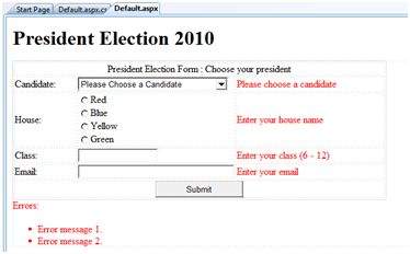
The following example describes a form to be filled up by all the students of a school, divided into four houses, for electing the school president. Here, we use the validation controls to validate the user input.
This is the form in design view:
The content file code is as given:
<form id="form1" runat="server">

   <table style="width: 66%;">

      <tr>
         <td class="style1" colspan="3" align="center">
         <asp:Label ID="lblmsg"
            Text="President Election Form : Choose your president"
            runat="server" />
         </td>
      </tr>

      <tr>
         <td class="style3">
            Candidate:
         </td>

         <td class="style2">
            <asp:DropDownList ID="ddlcandidate" runat="server"  style="width:239px">
               <asp:ListItem>Please Choose a Candidate</asp:ListItem>
               <asp:ListItem>M H Kabir</asp:ListItem>
               <asp:ListItem>Steve Taylor</asp:ListItem>
               <asp:ListItem>John Abraham</asp:ListItem>
               <asp:ListItem>Venus Williams</asp:ListItem>
            </asp:DropDownList>
         </td>

         <td>
            <asp:RequiredFieldValidator ID="rfvcandidate"
               runat="server" ControlToValidate ="ddlcandidate"
               ErrorMessage="Please choose a candidate"
               InitialValue="Please choose a candidate">
            </asp:RequiredFieldValidator>
         </td>
      </tr>

      <tr>
         <td class="style3">
            House:
         </td>

         <td class="style2">
            <asp:RadioButtonList ID="rblhouse" runat="server" RepeatLayout="Flow">
               <asp:ListItem>Red</asp:ListItem>
               <asp:ListItem>Blue</asp:ListItem>
               <asp:ListItem>Yellow</asp:ListItem>
               <asp:ListItem>Green</asp:ListItem>
            </asp:RadioButtonList>
         </td>

         <td>
            <asp:RequiredFieldValidator ID="rfvhouse" runat="server"
               ControlToValidate="rblhouse" ErrorMessage="Enter your house name" >
            </asp:RequiredFieldValidator>
            <br />
         </td>
      </tr>

      <tr>
         <td class="style3">
            Class:
         </td>

         <td class="style2">
            <asp:TextBox ID="txtclass" runat="server"></asp:TextBox>
         </td>

         <td>
            <asp:RangeValidator ID="rvclass"
               runat="server" ControlToValidate="txtclass"
               ErrorMessage="Enter your class (6 - 12)" MaximumValue="12"
               MinimumValue="6" Type="Integer">
            </asp:RangeValidator>
         </td>
      </tr>

      <tr>
         <td class="style3">
            Email:
         </td>

         <td class="style2">
            <asp:TextBox ID="txtemail" runat="server" style="width:250px">
            </asp:TextBox>
         </td>

         <td>
            <asp:RegularExpressionValidator ID="remail" runat="server"
               ControlToValidate="txtemail" ErrorMessage="Enter your email"
               ValidationExpression="\w+([-+.']\w+)*@\w+([-.]\w+)*\.\w+([-.]\w+)*">
            </asp:RegularExpressionValidator>
         </td>
      </tr>

      <tr>
         <td class="style3" align="center" colspan="3">
            <asp:Button ID="btnsubmit" runat="server" onclick="btnsubmit_Click"
               style="text-align: center" Text="Submit" style="width:140px" />
         </td>
      </tr>
   </table>
   <asp:ValidationSummary ID="ValidationSummary1" runat="server"
      DisplayMode ="BulletList" ShowSummary ="true" HeaderText="Errors:" />
</form>
The code behind the submit button:
protected void btnsubmit_Click(object sender, EventArgs e)
{
   if (Page.IsValid)
   {
      lblmsg.Text = "Thank You";
   }
   else
   {
      lblmsg.Text = "Fill up all the fields";
   }
}
Database Access
ASP.NET allows the following sources of data to be accessed and used:
- Databases (e.g., Access, SQL Server, Oracle, MySQL)
- XML documents
- Business Objects
- Flat files
ASP.NET hides the complex processes of data access and provides much higher level of classes and objects through which data is accessed easily. These classes hide all complex coding for connection, data retrieving, data querying, and data manipulation.
ADO.NET is the technology that provides the bridge between various ASP.NET control objects and the backend data source. In this tutorial, we will look at data access and working with the data in brief.
Retrieve and display data
It takes two types of data controls to retrieve and display data in ASP.NET:
A data source control - It manages the connection to the data, selection of data, and other jobs such as paging and caching of data etc.
A data view control - It binds and displays the data and allows data manipulation.
We will discuss the data binding and data source controls in detail later. In this section, we will use a SqlDataSource control to access data and a GridView control to display and manipulate data in this chapter.
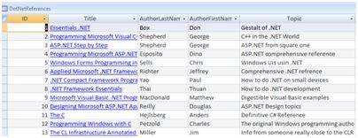
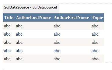
We will also use an Access database, which contains the details about .Net books available in the market. Name of our database is ASPDotNetStepByStep.mdb and we will use the data table DotNetReferences.
The table has the following columns: ID, Title, AuthorFirstName, AuthorLastName, Topic, and Publisher.
Here is a snapshot of the data table:
Let us directly move to action, take the following steps:
(1) Create a web site and add a SqlDataSourceControl on the web form.
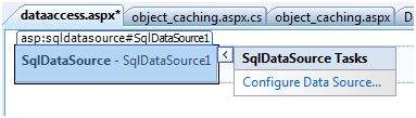
(2) Click on the Configure Data Source option.

(3) Click on the New Connection button to establish connection with a database.
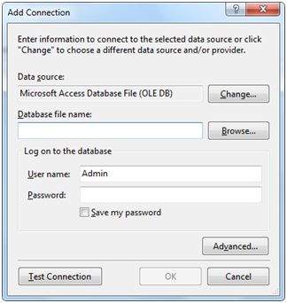
(4) Once the connection is set up, you may save it for further use. At the next step, you are asked to configure the select statement:
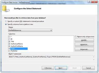
(5) Select the columns and click next to complete the steps. Observe the WHERE, ORDER BY, and the Advanced buttons. These buttons allow you to provide the where clause, order by clause, and specify the insert, update, and delete commands of SQL respectively. This way, you can manipulate the data.
(6) Add a GridView control on the form. Choose the data source and format the control using AutoFormat option.
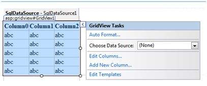
(7) After this the formatted GridView control displays the column headings, and the application is ready to execute.
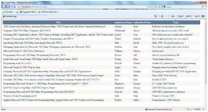
(8) Finally execute the application.
The content file code is as given:
<%@ Page Language="C#" AutoEventWireup="true" CodeBehind="dataaccess.aspx.cs"
   Inherits="datacaching.WebForm1" %>

<!DOCTYPE html PUBLIC "-//W3C//DTD XHTML 1.0 Transitional//EN"
   "http://www.w3.org/TR/xhtml1/DTD/xhtml1-transitional.dtd">

<html xmlns="http://www.w3.org/1999/xhtml" >

   <head runat="server">
      <title>
         Untitled Page
      </title>
   </head>

   <body>
      <form id="form1" runat="server">
         <div>

            <asp:SqlDataSource ID="SqlDataSource1" runat="server"
               ConnectionString= "<%$   ConnectionStrings:ASPDotNetStepByStepConnectionString%>"
               ProviderName= "<%$ ConnectionStrings:
                  ASPDotNetStepByStepConnectionString.ProviderName %>"
               SelectCommand="SELECT [Title], [AuthorLastName],
                  [AuthorFirstName], [Topic] FROM [DotNetReferences]">
            </asp:SqlDataSource>

            <asp:GridView ID="GridView1" runat="server"
               AutoGenerateColumns="False" CellPadding="4"
               DataSourceID="SqlDataSource1" ForeColor="#333333"
               GridLines="None">
               <RowStyle BackColor="#F7F6F3" ForeColor="#333333" />

               <Columns>
                  <asp:BoundField DataField="Title" HeaderText="Title"
                     SortExpression="Title" />
                  <asp:BoundField DataField="AuthorLastName"
                     HeaderText="AuthorLastName" SortExpression="AuthorLastName" />
                  <asp:BoundField DataField="AuthorFirstName"
                     HeaderText="AuthorFirstName" SortExpression="AuthorFirstName" />
                  <asp:BoundField DataField="Topic"
                     HeaderText="Topic" SortExpression="Topic" />
               </Columns>
               <FooterStyle BackColor="#5D7B9D"
                  Font-Bold="True" ForeColor="White" />
               <PagerStyle BackColor="#284775"
                  ForeColor="White" HorizontalAlign="Center" />
               <SelectedRowStyle BackColor="#E2DED6"
                  Font-Bold="True" ForeColor="#333333" />
               <HeaderStyle BackColor="#5D7B9D" Font-Bold="True"
                  ForeColor="White" />
               <EditRowStyle BackColor="#999999" />
               <AlternatingRowStyle BackColor="White" ForeColor="#284775" />
            </asp:GridView>
         </div>
      </form>
   </body>
</html>
ADO.net
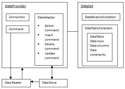
ADO.NET provides a bridge between the front end controls and the back end database. The ADO.NET objects encapsulate all the data access operations and the controls interact with these objects to display data, thus hiding the details of movement of data.
The following figure shows the ADO.NET objects at a glance:
The DataSet Class
The dataset represents a subset of the database. It does not have a continuous connection to the database. To update the database a reconnection is required. The DataSet contains DataTable objects and DataRelation objects. The DataRelation objects represent the relationship between two tables.
Following table shows some important properties of the DataSet class:
| Properties | Description |
|---|---|
| CaseSensitive | Indicates whether string comparisons within the data tables are case-sensitive. |
| Container | Gets the container for the component. |
| DataSetName | Gets or sets the name of the current data set. |
| DefaultViewManager | Returns a view of data in the data set. |
| DesignMode | Indicates whether the component is currently in design mode. |
| EnforceConstraints | Indicates whether constraint rules are followed when attempting any update operation. |
| Events | Gets the list of event handlers that are attached to this component. |
| ExtendedProperties | Gets the collection of customized user information associated with the DataSet. |
| HasErrors | Indicates if there are any errors. |
| IsInitialized | Indicates whether the DataSet is initialized. |
| Locale | Gets or sets the locale information used to compare strings within the table. |
| Namespace | Gets or sets the namespace of the DataSet. |
| Prefix | Gets or sets an XML prefix that aliases the namespace of the DataSet. |
| Relations | Returns the collection of DataRelation objects. |
| Tables | Returns the collection of DataTable objects. |
The following table shows some important methods of the DataSet class:
| Methods | Description |
|---|---|
| AcceptChanges | Accepts all changes made since the DataSet was loaded or this method was called. |
| BeginInit | Begins the initialization of the DataSet. The initialization occurs at run time. |
| Clear | Clears data. |
| Clone | Copies the structure of the DataSet, including all DataTable schemas, relations, and constraints. Does not copy any data. |
| Copy | Copies both structure and data. |
| CreateDataReader() | Returns a DataTableReader with one result set per DataTable, in the same sequence as the tables appear in the Tables collection. |
| CreateDataReader(DataTable[]) | Returns a DataTableReader with one result set per DataTable. |
| EndInit | Ends the initialization of the data set. |
| Equals(Object) | Determines whether the specified Object is equal to the current Object. |
| Finalize | Free resources and perform other cleanups. |
| GetChanges | Returns a copy of the DataSet with all changes made since it was loaded or the AcceptChanges method was called. |
| GetChanges(DataRowState) | Gets a copy of DataSet with all changes made since it was loaded or the AcceptChanges method was called, filtered by DataRowState. |
| GetDataSetSchema | Gets a copy of XmlSchemaSet for the DataSet. |
| GetObjectData | Populates a serialization information object with the data needed to serialize the DataSet. |
| GetType | Gets the type of the current instance. |
| GetXML | Returns the XML representation of the data. |
| GetXMLSchema | Returns the XSD schema for the XML representation of the data. |
| HasChanges() | Gets a value indicating whether the DataSet has changes, including new, deleted, or modified rows. |
| HasChanges(DataRowState) | Gets a value indicating whether the DataSet has changes, including new, deleted, or modified rows, filtered by DataRowState. |
| IsBinarySerialized | Inspects the format of the serialized representation of the DataSet. |
| Load(IDataReader, LoadOption, DataTable[]) | Fills a DataSet with values from a data source using the supplied IDataReader, using an array of DataTable instances to supply the schema and namespace information. |
| Load(IDataReader, LoadOption, String[]) | Fills a DataSet with values from a data source using the supplied IDataReader, using an array of strings to supply the names for the tables within the DataSet. |
| Merge() | Merges the data with data from another DataSet. This method has different overloaded forms. |
| ReadXML() | Reads an XML schema and data into the DataSet. This method has different overloaded forms. |
| ReadXMLSchema(0) | Reads an XML schema into the DataSet. This method has different overloaded forms. |
| RejectChanges | Rolls back all changes made since the last call to AcceptChanges. |
| WriteXML() | Writes an XML schema and data from the DataSet. This method has different overloaded forms. |
| WriteXMLSchema() | Writes the structure of the DataSet as an XML schema. This method has different overloaded forms. |
The DataTable Class
The DataTable class represents the tables in the database. It has the following important properties; most of these properties are read only properties except the PrimaryKey property:
| Properties | Description |
|---|---|
| ChildRelations | Returns the collection of child relationship. |
| Columns | Returns the Columns collection. |
| Constraints | Returns the Constraints collection. |
| DataSet | Returns the parent DataSet. |
| DefaultView | Returns a view of the table. |
| ParentRelations | Returns the ParentRelations collection. |
| PrimaryKey | Gets or sets an array of columns as the primary key for the table. |
| Rows | Returns the Rows collection. |
The following table shows some important methods of the DataTable class:
| Methods | Description |
|---|---|
| AcceptChanges | Commits all changes since the last AcceptChanges. |
| Clear | Clears all data from the table. |
| GetChanges | Returns a copy of the DataTable with all changes made since the AcceptChanges method was called. |
| GetErrors | Returns an array of rows with errors. |
| ImportRows | Copies a new row into the table. |
| LoadDataRow | Finds and updates a specific row, or creates a new one, if not found any. |
| Merge | Merges the table with another DataTable. |
| NewRow | Creates a new DataRow. |
| RejectChanges | Rolls back all changes made since the last call to AcceptChanges. |
| Reset | Resets the table to its original state. |
| Select | Returns an array of DataRow objects. |
The DataRow Class
The DataRow object represents a row in a table. It has the following important properties:
| Properties | Description |
|---|---|
| HasErrors | Indicates if there are any errors. |
| Items | Gets or sets the data stored in a specific column. |
| ItemArrays | Gets or sets all the values for the row. |
| Table | Returns the parent table. |
The following table shows some important methods of the DataRow class:
| Methods | Description |
|---|---|
| AcceptChanges | Accepts all changes made since this method was called. |
| BeginEdit | Begins edit operation. |
| CancelEdit | Cancels edit operation. |
| Delete | Deletes the DataRow. |
| EndEdit | Ends the edit operation. |
| GetChildRows | Gets the child rows of this row. |
| GetParentRow | Gets the parent row. |
| GetParentRows | Gets parent rows of DataRow object. |
| RejectChanges | Rolls back all changes made since the last call to AcceptChanges. |
The DataAdapter Object
The DataAdapter object acts as a mediator between the DataSet object and the database. This helps the Dataset to contain data from multiple databases or other data source.
The DataReader Object
The DataReader object is an alternative to the DataSet and DataAdapter combination. This object provides a connection oriented access to the data records in the database. These objects are suitable for read-only access, such as populating a list and then breaking the connection.
DbCommand and DbConnection Objects
The DbConnection object represents a connection to the data source. The connection could be shared among different command objects.
The DbCommand object represents the command or a stored procedure sent to the database from retrieving or manipulating data.
Example
So far, we have used tables and databases already existing in our computer. In this example, we will create a table, add column, rows and data into it and display the table using a GridView object.
The source file code is as given:
<%@ Page Language="C#" AutoEventWireup="true" CodeBehind="Default.aspx.cs" Inherits="createdatabase._Default" %>

<!DOCTYPE html PUBLIC "-//W3C//DTD XHTML 1.0 Transitional//EN" "http://www.w3.org/TR/xhtml1/DTD/xhtml1-transitional.dtd">

<html xmlns="http://www.w3.org/1999/xhtml" >

   <head runat="server">
      <title>
         Untitled Page
      </title>
   </head>

   <body>
      <form id="form1" runat="server">

         <div>
            <asp:GridView ID="GridView1" runat="server">
            </asp:GridView>
         </div>

      </form>
   </body>

</html>
The code behind file is as given:
namespace createdatabase
{
   public partial class _Default : System.Web.UI.Page
   {
      protected void Page_Load(object sender, EventArgs e)
      {
         if (!IsPostBack)
         {
            DataSet ds = CreateDataSet();
            GridView1.DataSource = ds.Tables["Student"];
            GridView1.DataBind();
         }
      }

      private DataSet CreateDataSet()
      {
         //creating a DataSet object for tables
         DataSet dataset = new DataSet();

         // creating the student table
         DataTable Students = CreateStudentTable();
         dataset.Tables.Add(Students);
         return dataset;
      }

      private DataTable CreateStudentTable()
      {
         DataTable Students = new DataTable("Student");

         // adding columns
         AddNewColumn(Students, "System.Int32", "StudentID");
         AddNewColumn(Students, "System.String", "StudentName");
         AddNewColumn(Students, "System.String", "StudentCity");

         // adding rows
         AddNewRow(Students, 1, "M H Kabir", "Kolkata");
         AddNewRow(Students, 1, "Shreya Sharma", "Delhi");
         AddNewRow(Students, 1, "Rini Mukherjee", "Hyderabad");
         AddNewRow(Students, 1, "Sunil Dubey", "Bikaner");
         AddNewRow(Students, 1, "Rajat Mishra", "Patna");

         return Students;
      }

      private void AddNewColumn(DataTable table, string columnType, string  columnName)
      {
         DataColumn column = table.Columns.Add(columnName,  Type.GetType(columnType));
      }

      //adding data into the table
      private void AddNewRow(DataTable table, int id, string name, string city)
      {
         DataRow newrow = table.NewRow();
         newrow["StudentID"] = id;
         newrow["StudentName"] = name;
         newrow["StudentCity"] = city;
         table.Rows.Add(newrow);
      }
   }
}
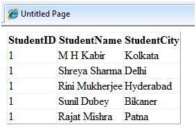
When you execute the program, observe the following:
The application first creates a data set and binds it with the grid view control using the DataBind() method of the GridView control.
The Createdataset() method is a user defined function, which creates a new DataSet object and then calls another user defined method CreateStudentTable() to create the table and add it to the Tables collection of the data set.
The CreateStudentTable() method calls the user defined methods AddNewColumn() and AddNewRow() to create the columns and rows of the table as well as to add data to the rows.
When the page is executed, it returns the rows of the table as shown:
File Uploading
ASP.NET has two controls that allow users to upload files to the web server. Once the server receives the posted file data, the application can save it, check it, or ignore it. The following controls allow the file uploading:
HtmlInputFile - an HTML server control
FileUpload - and ASP.NET web control
Both controls allow file uploading, but the FileUpload control automatically sets the encoding of the form, whereas the HtmlInputFile does not do so.
In this tutorial, we use the FileUpload control. The FileUpload control allows the user to browse for and select the file to be uploaded, providing a browse button and a text box for entering the filename.
Once, the user has entered the filename in the text box by typing the name or browsing, the SaveAs method of the FileUpload control can be called to save the file to the disk.
The basic syntax of FileUpload is:
<asp:FileUpload ID= "Uploader" runat = "server" />
The FileUpload class is derived from the WebControl class, and inherits all its members. Apart from those, the FileUpload class has the following read-only properties:
| Properties | Description |
|---|---|
| FileBytes | Returns an array of the bytes in a file to be uploaded. |
| FileContent | Returns the stream object pointing to the file to be uploaded. |
| FileName | Returns the name of the file to be uploaded. |
| HasFile | Specifies whether the control has a file to upload. |
| PostedFile | Returns a reference to the uploaded file. |
The posted file is encapsulated in an object of type HttpPostedFile, which could be accessed through the PostedFile property of the FileUpload class.
The HttpPostedFile class has the following frequently used properties:
| Properties | Description |
|---|---|
| ContentLength | Returns the size of the uploaded file in bytes. |
| ContentType | Returns the MIME type of the uploaded file. |
| FileName | Returns the full filename. |
| InputStream | Returns a stream object pointing to the uploaded file. |
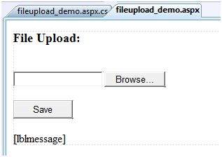
Example
The following example demonstrates the FileUpload control and its properties. The form has a FileUpload control along with a save button and a label control for displaying the file name, file type, and file length.
In the design view, the form looks as follows:
The content file code is as given:
<body>
   <form id="form1" runat="server">

      <div>
         <h3> File Upload:</h3>
         <br />
         <asp:FileUpload ID="FileUpload1" runat="server" />
         <br /><br />
         <asp:Button ID="btnsave" runat="server" onclick="btnsave_Click"  Text="Save" style="width:85px" />
         <br /><br />
         <asp:Label ID="lblmessage" runat="server" />
      </div>

   </form>
</body>
The code behind the save button is as given:
protected void btnsave_Click(object sender, EventArgs e)
{
   StringBuilder sb = new StringBuilder();

   if (FileUpload1.HasFile)
   {
      try
      {
         sb.AppendFormat(" Uploading file: {0}", FileUpload1.FileName);

         //saving the file
         FileUpload1.SaveAs("<c:\\SaveDirectory>" + FileUpload1.FileName);

         //Showing the file information
         sb.AppendFormat("<br/> Save As: {0}",  FileUpload1.PostedFile.FileName);
         sb.AppendFormat("<br/> File type: {0}",    FileUpload1.PostedFile.ContentType);
         sb.AppendFormat("<br/> File length: {0}",  FileUpload1.PostedFile.ContentLength);
         sb.AppendFormat("<br/> File name: {0}",  FileUpload1.PostedFile.FileName);

      }catch (Exception ex)
      {
         sb.Append("<br/> Error <br/>");
         sb.AppendFormat("Unable to save file <br/> {0}", ex.Message);
      }
   }
   else
   {
      lblmessage.Text = sb.ToString();
   }
}
Note the following:
The StringBuilder class is derived from System.IO namespace, so it needs to be included.
The try and catch blocks are used for catching errors, and display the error message.
Ad Rotator
The AdRotator control randomly selects banner graphics from a list, which is specified in an external XML schedule file. This external XML schedule file is called the advertisement file.
The AdRotator control allows you to specify the advertisement file and the type of window that the link should follow in the AdvertisementFile and the Target property respectively.
The basic syntax of adding an AdRotator is as follows:
<asp:AdRotator runat = "server" AdvertisementFile = "adfile.xml" Target = "_blank" />
Before going into the details of the AdRotator control and its properties, let us look into the construction of the advertisement file.
The Advertisement File
The advertisement file is an XML file, which contains the information about the advertisements to be displayed.
Extensible Markup Language (XML) is a W3C standard for text document markup. It is a text-based markup language that enables you to store data in a structured format by using meaningful tags. The term 'extensible' implies that you can extend your ability to describe a document by defining meaningful tags for the application.
XML is not a language in itself, like HTML, but a set of rules for creating new markup languages. It is a meta-markup language. It allows developers to create custom tag sets for special uses. It structures, stores, and transports the information.
Following is an example of XML file:
<BOOK>
   <NAME> Learn XML </NAME>
   <AUTHOR> Samuel Peterson </AUTHOR>
   <PUBLISHER> NSS Publications </PUBLISHER>
   <PRICE> $30.00</PRICE>
</BOOK>
Like all XML files, the advertisement file needs to be a structured text file with well-defined tags delineating the data. There are the following standard XML elements that are commonly used in the advertisement file:
| Element | Description |
|---|---|
| Advertisements | Encloses the advertisement file. |
| Ad | Delineates separate ad. |
| ImageUrl | The path of image that will be displayed. |
| NavigateUrl | The link that will be followed when the user clicks the ad. |
| AlternateText | The text that will be displayed instead of the picture if it cannot be displayed. |
| Keyword | Keyword identifying a group of advertisements. This is used for filtering. |
| Impressions | The number indicating how often an advertisement will appear. |
| Height | Height of the image to be displayed. |
| Width | Width of the image to be displayed. |
Apart from these tags, customs tags with custom attributes could also be included. The following code illustrates an advertisement file ads.xml:
<Advertisements>
   <Ad>
      <ImageUrl>rose1.jpg</ImageUrl>
      <NavigateUrl>http://www.1800flowers.com</NavigateUrl>
      <AlternateText>
         Order flowers, roses, gifts and more
      </AlternateText>
      <Impressions>20</Impressions>
      <Keyword>flowers</Keyword>
   </Ad>

   <Ad>
      <ImageUrl>rose2.jpg</ImageUrl>
      <NavigateUrl>http://www.babybouquets.com.au</NavigateUrl>
      <AlternateText>Order roses and flowers</AlternateText>
      <Impressions>20</Impressions>
      <Keyword>gifts</Keyword>
   </Ad>

   <Ad>
      <ImageUrl>rose3.jpg</ImageUrl>
      <NavigateUrl>http://www.flowers2moscow.com</NavigateUrl>
      <AlternateText>Send flowers to Russia</AlternateText>
      <Impressions>20</Impressions>
      <Keyword>russia</Keyword>
   </Ad>

   <Ad>
      <ImageUrl>rose4.jpg</ImageUrl>
      <NavigateUrl>http://www.edibleblooms.com</NavigateUrl>
      <AlternateText>Edible Blooms</AlternateText>
      <Impressions>20</Impressions>
      <Keyword>gifts</Keyword>
   </Ad>
</Advertisements>
Properties and Events of the AdRotator Class
The AdRotator class is derived from the WebControl class and inherits its properties. Apart from those, the AdRotator class has the following properties:
| Properties | Description |
|---|---|
| AdvertisementFile | The path to the advertisement file. |
| AlternateTextFeild | The element name of the field where alternate text is provided. The default value is AlternateText. |
| DataMember | The name of the specific list of data to be bound when advertisement file is not used. |
| DataSource | Control from where it would retrieve data. |
| DataSourceID | Id of the control from where it would retrieve data. |
| Font | Specifies the font properties associated with the advertisement banner control. |
| ImageUrlField | The element name of the field where the URL for the image is provided. The default value is ImageUrl. |
| KeywordFilter | For displaying the keyword based ads only. |
| NavigateUrlField | The element name of the field where the URL to navigate to is provided. The default value is NavigateUrl. |
| Target | The browser window or frame that displays the content of the page linked. |
| UniqueID | Obtains the unique, hierarchically qualified identifier for the AdRotator control. |
Following are the important events of the AdRotator class:
| Events | Description |
|---|---|
| AdCreated | It is raised once per round trip to the server after creation of the control, but before the page is rendered |
| DataBinding | Occurs when the server control binds to a data source. |
| DataBound | Occurs after the server control binds to a data source. |
| Disposed | Occurs when a server control is released from memory, which is the last stage of the server control lifecycle when an ASP.NET page is requested |
| Init | Occurs when the server control is initialized, which is the first step in its lifecycle. |
| Load | Occurs when the server control is loaded into the Page object. |
| PreRender | Occurs after the Control object is loaded but prior to rendering. |
| Unload | Occurs when the server control is unloaded from memory. |
Working with AdRotator Control
Create a new web page and place an AdRotator control on it.
<form id="form1" runat="server">
   <div>
      <asp:AdRotator ID="AdRotator1" runat="server" AdvertisementFile  ="~/ads.xml" onadcreated="AdRotator1_AdCreated" />
   </div>
</form>
The ads.xml file and the image files should be located in the root directory of the web site.
Try to execute the above application and observe that each time the page is reloaded, the ad is changed.
Clanders
The calendar control is a functionally rich web control, which provides the following capabilities:
- Displaying one month at a time
- Selecting a day, a week or a month
- Selecting a range of days
- Moving from month to month
- Controlling the display of the days programmatically
The basic syntax of a calendar control is:
<asp:Calender ID = "Calendar1" runat = "server">
</asp:Calender>
Properties and Events of the Calendar Control
The calendar control has many properties and events, using which you can customize the actions and display of the control. The following table provides some important properties of the Calendar control:
| Properties | Description |
|---|---|
| Caption | Gets or sets the caption for the calendar control. |
| CaptionAlign | Gets or sets the alignment for the caption. |
| CellPadding | Gets or sets the number of spaces between the data and the cell border. |
| CellSpacing | Gets or sets the space between cells. |
| DayHeaderStyle | Gets the style properties for the section that displays the day of the week. |
| DayNameFormat | Gets or sets format of days of the week. |
| DayStyle | Gets the style properties for the days in the displayed month. |
| FirstDayOfWeek | Gets or sets the day of week to display in the first column. |
| NextMonthText | Gets or sets the text for next month navigation control. The default value is >. |
| NextPrevFormat | Gets or sets the format of the next and previous month navigation control. |
| OtherMonthDayStyle | Gets the style properties for the days on the Calendar control that are not in the displayed month. |
| PrevMonthText | Gets or sets the text for previous month navigation control. The default value is <. |
| SelectedDate | Gets or sets the selected date. |
| SelectedDates | Gets a collection of DateTime objects representing the selected dates. |
| SelectedDayStyle | Gets the style properties for the selected dates. |
| SelectionMode | Gets or sets the selection mode that specifies whether the user can select a single day, a week or an entire month. |
| SelectMonthText | Gets or sets the text for the month selection element in the selector column. |
| SelectorStyle | Gets the style properties for the week and month selector column. |
| SelectWeekText | Gets or sets the text displayed for the week selection element in the selector column. |
| ShowDayHeader | Gets or sets the value indicating whether the heading for the days of the week is displayed. |
| ShowGridLines | Gets or sets the value indicating whether the gridlines would be shown. |
| ShowNextPrevMonth | Gets or sets a value indicating whether next and previous month navigation elements are shown in the title section. |
| ShowTitle | Gets or sets a value indicating whether the title section is displayed. |
| TitleFormat | Gets or sets the format for the title section. |
| Titlestyle | Get the style properties of the title heading for the Calendar control. |
| TodayDayStyle | Gets the style properties for today's date on the Calendar control. |
| TodaysDate | Gets or sets the value for today's date. |
| UseAccessibleHeader | Gets or sets a value that indicates whether to render the table header <th> HTML element for the day headers instead of the table data <td> HTML element. |
| VisibleDate | Gets or sets the date that specifies the month to display. |
| WeekendDayStyle | Gets the style properties for the weekend dates on the Calendar control. |
The Calendar control has the following three most important events that allow the developers to program the calendar control. They are:
| Events | Description |
|---|---|
| SelectionChanged | It is raised when a day, a week or an entire month is selected. |
| DayRender | It is raised when each data cell of the calendar control is rendered. |
| VisibleMonthChanged | It is raised when user changes a month. |
Working with the Calendar Control
Putting a bare-bone calendar control without any code behind file provides a workable calendar to a site, which shows the months and days of the year. It also allows navigation to next and previous months.
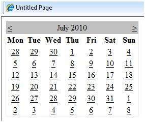
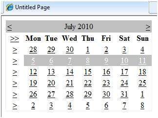
Calendar controls allow the users to select a single day, a week, or an entire month. This is done by using the SelectionMode property. This property has the following values:
| Properties | Description |
|---|---|
| Day | To select a single day. |
| DayWeek | To select a single day or an entire week. |
| DayWeekMonth | To select a single day, a week, or an entire month. |
| None | Nothing can be selected. |
The syntax for selecting days:
<asp:Calender ID = "Calendar1" runat = "server" SelectionMode="DayWeekMonth">
</asp:Calender>
When the selection mode is set to the value DayWeekMonth, an extra column with the > symbol appears for selecting the week, and a >> symbol appears to the left of the days name for selecting the month.
Example
The following example demonstrates selecting a date and displays the date in a label:
The content file code is as follows:
<%@ Page Language="C#" AutoEventWireup="true" CodeBehind="Default.aspx.cs" Inherits="calendardemo._Default" %>
<!DOCTYPE html PUBLIC "-//W3C//DTD XHTML 1.0 Transitional//EN" "http://www.w3.org/TR/xhtml1/DTD/xhtml1-transitional.dtd">
<html xmlns="http://www.w3.org/1999/xhtml" >
<head runat="server">
<title>
Untitled Page
</title>
</head>
<body>
<form id="form1" runat="server">
<div>
<h3> Your Birthday:</h3>
<asp:Calendar ID="Calendar1" runat="server SelectionMode="DayWeekMonth" onselectionchanged="Calendar1_SelectionChanged">
</asp:Calendar>
</div>
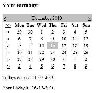
<p>Todays date is:
<asp:Label ID="lblday" runat="server"></asp:Label>
</p>
<p>Your Birday is:
<asp:Label ID="lblbday" runat="server"></asp:Label>
</p>
</form>
</body>
</html>
The event handler for the event SelectionChanged:
protected void Calendar1_SelectionChanged(object sender, EventArgs e)
{
   lblday.Text = Calendar1.TodaysDate.ToShortDateString();
   lblbday.Text = Calendar1.SelectedDate.ToShortDateString();
}
When the file is run, it should produce the following output:
Multi Views
MultiView and View controls allow you to divide the content of a page into different groups, displaying only one group at a time. Each View control manages one group of content and all the View controls are held together in a MultiView control.
The MultiView control is responsible for displaying one View control at a time. The View displayed is called the active view.
The syntax of MultiView control is:
<asp:MultView ID= "MultiView1" runat= "server">
</asp:MultiView>
The syntax of View control is:
<asp:View ID= "View1" runat= "server">
</asp:View>
However, the View control cannot exist on its own. It would render error if you try to use it stand-alone. It is always used with a Multiview control as:
<asp:MultView ID= "MultiView1" runat= "server">
   <asp:View ID= "View1" runat= "server"> </asp:View>
</asp:MultiView>
Properties of View and MultiView Controls
Both View and MultiView controls are derived from Control class and inherit all its properties, methods, and events. The most important property of the View control is Visible property of type Boolean, which sets the visibility of a view.
The MultiView control has the following important properties:
| Properties | Description |
|---|---|
| Views | Collection of View controls within the MultiView. |
| ActiveViewIndex | A zero based index that denotes the active view. If no view is active, then the index is -1. |
The CommandName attribute of the button control associated with the navigation of the MultiView control are associated with some related field of the MultiView control.
For example, if a button control with CommandName value as NextView is associated with the navigation of the multiview, it automatically navigates to the next view when the button is clicked.
The following table shows the default command names of the above properties:
| Properties | Description |
|---|---|
| NextViewCommandName | NextView |
| PreviousViewCommandName | PrevView |
| SwitchViewByIDCommandName | SwitchViewByID |
| SwitchViewByIndexCommandName | SwitchViewByIndex |
The important methods of the multiview control are:
| Methods | Description |
|---|---|
| SetActiveview | Sets the active view |
| GetActiveview | Retrieves the active view |
Every time a view is changed, the page is posted back to the server and a number of events are raised. Some important events are:
| Events | Description |
|---|---|
| ActiveViewChanged | Raised when a view is changed |
| Activate | Raised by the active view |
| Deactivate | Raised by the inactive view |
Apart from the above mentioned properties, methods and events, multiview control inherits the members of the control and object class.
Example
The example page has three views. Each view has two button for navigating through the views.
The content file code is as follows:
<%@ Page Language="C#" AutoEventWireup="true" CodeBehind="Default.aspx.cs" Inherits="multiviewdemo._Default" %>
<!DOCTYPE html PUBLIC "-//W3C//DTD XHTML 1.0 Transitional//EN" "http://www.w3.org/TR/xhtml1/DTD/xhtml1-transitional.dtd">
<html xmlns="http://www.w3.org/1999/xhtml" >
<head runat="server">
<title>
Untitled Page
</title>
</head>
<body>
<form id="form1" runat="server">
<div>
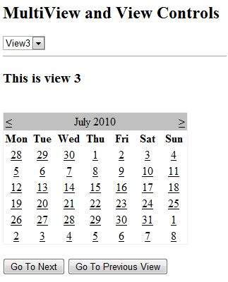
<h2>MultiView and View Controls</h2>
<asp:DropDownList ID="DropDownList1" runat="server" onselectedindexchanged="DropDownList1_SelectedIndexChanged">
</asp:DropDownList>
<hr />
<asp:MultiView ID="MultiView1" runat="server" ActiveViewIndex="2" onactiveviewchanged="MultiView1_ActiveViewChanged" >
<asp:View ID="View1" runat="server">
<h3>This is view 1</h3>
<br />
<asp:Button CommandName="NextView" ID="btnnext1" runat="server" Text = "Go To Next" />
<asp:Button CommandArgument="View3" CommandName="SwitchViewByID" ID="btnlast" runat="server" Text ="Go To Last" />
</asp:View>
<asp:View ID="View2" runat="server">
<h3>This is view 2</h3>
<asp:Button CommandName="NextView" ID="btnnext2" runat="server" Text = "Go To Next" />
<asp:Button CommandName="PrevView" ID="btnprevious2" runat="server" Text = "Go To Previous View" />
</asp:View>
<asp:View ID="View3" runat="server">
<h3> This is view 3</h3>
<br />
<asp:Calendar ID="Calender1" runat="server"></asp:Calendar>
<br />
<asp:Button CommandArgument="0" CommandName="SwitchViewByIndex" ID="btnfirst" runat="server" Text = "Go To Next" />
<asp:Button CommandName="PrevView" ID="btnprevious" runat="server" Text = "Go To Previous View" />
</asp:View>
</asp:MultiView>
</div>
</form>
</body>
</html>
Observe the following:
The MultiView.ActiveViewIndex determines which view will be shown. This is the only view rendered on the page. The default value for the ActiveViewIndex is -1, when no view is shown. Since the ActiveViewIndex is defined as 2 in the example, it shows the third view, when executed.
Panel Controls
The Panel control works as a container for other controls on the page. It controls the appearance and visibility of the controls it contains. It also allows generating controls programmatically.
The basic syntax of panel control is as follows:
<asp:Panel ID= "Panel1"  runat = "server">
</asp:Panel>
The Panel control is derived from the WebControl class. Hence it inherits all the properties, methods and events of the same. It does not have any method or event of its own. However it has the following properties of its own:
| Properties | Description |
|---|---|
| BackImageUrl | URL of the background image of the panel. |
| DefaultButton | Gets or sets the identifier for the default button that is contained in the Panel control. |
| Direction | Text direction in the panel. |
| GroupingText | Allows grouping of text as a field. |
| HorizontalAlign | Horizontal alignment of the content in the panel. |
| ScrollBars | Specifies visibility and location of scrollbars within the panel. |
| Wrap | Allows text wrapping. |
Working with the Panel Control
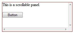
Let us start with a simple scrollable panel of specific height and width and a border style. The ScrollBars property is set to both the scrollbars, hence both the scrollbars are rendered.
The source file has the following code for the panel tag:
<asp:Panel ID="Panel1" runat="server" BorderColor="#990000" BorderStyle="Solid"
   Borderstyle="width:1px" Height="116px" ScrollBars="Both" style="width:278px">

   This is a scrollable panel.
   <br />
   <br />

   <asp:Button ID="btnpanel" runat="server" Text="Button" style="width:82px" />
</asp:Panel>
The panel is rendered as follows:
Example
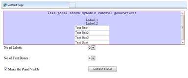
The following example demonstrates dynamic content generation. The user provides the number of label controls and textboxes to be generated on the panel. The controls are generated programmatically.
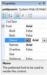
Change the properties of the panel using the properties window. When you select a control on the design view, the properties window displays the properties of that particular control and allows you to make changes without typing.
The source file for the example is as follows:
<form id="form1" runat="server">
   <div>
      <asp:Panel ID="pnldynamic" runat="server" BorderColor="#990000"
         BorderStyle="Solid" Borderstyle="width:1px" Height="150px"  ScrollBars="Auto" style="width:60%" BackColor="#CCCCFF"  Font-Names="Courier" HorizontalAlign="Center">

         This panel shows dynamic control generation:
         <br />
         <br />
      </asp:Panel>
   </div>

   <table style="width: 51%;">
      <tr>
         <td class="style2">No of Labels:</td>
         <td class="style1">
            <asp:DropDownList ID="ddllabels" runat="server">
               <asp:ListItem>0</asp:ListItem>
               <asp:ListItem>1</asp:ListItem>
               <asp:ListItem>2</asp:ListItem>
               <asp:ListItem>3</asp:ListItem>
               <asp:ListItem>4</asp:ListItem>
            </asp:DropDownList>
         </td>
      </tr>

      <tr>
         <td class="style2"> </td>
         <td class="style1"> </td>
      </tr>

      <tr>
         <td class="style2">No of Text Boxes :</td>
         <td class="style1">
            <asp:DropDownList ID="ddltextbox" runat="server">
               <asp:ListItem>0</asp:ListItem>
               <asp:ListItem Value="1"></asp:ListItem>
               <asp:ListItem>2</asp:ListItem>
               <asp:ListItem>3</asp:ListItem>
               <asp:ListItem Value="4"></asp:ListItem>
            </asp:DropDownList>
         </td>
      </tr>

      <tr>
         <td class="style2"> </td>
         <td class="style1"> </td>
      </tr>

      <tr>
         <td class="style2">
            <asp:CheckBox ID="chkvisible" runat="server"
               Text="Make the Panel Visible" />
         </td>

         <td class="style1">
            <asp:Button ID="btnrefresh" runat="server" Text="Refresh Panel"
               style="width:129px" />
         </td>
      </tr>
   </table>
</form>
The code behind the Page_Load event is responsible for generating the controls dynamically:
public partial class _Default : System.Web.UI.Page
{
   protected void Page_Load(object sender, EventArgs e)
   {
      //make the panel visible
      pnldynamic.Visible = chkvisible.Checked;

      //generating the lable controls:
      int n = Int32.Parse(ddllabels.SelectedItem.Value);
      for (int i = 1; i <= n; i++)
      {
         Label lbl = new Label();
         lbl.Text = "Label" + (i).ToString();
         pnldynamic.Controls.Add(lbl);
         pnldynamic.Controls.Add(new LiteralControl("<br />"));
      }

      //generating the text box controls:

      int m = Int32.Parse(ddltextbox.SelectedItem.Value);
      for (int i = 1; i <= m; i++)
      {
         TextBox txt = new TextBox();
         txt.Text = "Text Box" + (i).ToString();
         pnldynamic.Controls.Add(txt);
         pnldynamic.Controls.Add(new LiteralControl("<br />"));
      }
   }
}
When executed, the panel is rendered as:
Data Sources
A data source control interacts with the data-bound controls and hides the complex data binding processes. These are the tools that provide data to the data bound controls and support execution of operations like insertions, deletions, sorting, and updates.
Each data source control wraps a particular data provider-relational databases, XML documents, or custom classes and helps in:
- Managing connection
- Selecting data
- Managing presentation aspects like paging, caching, etc.
- Manipulating data
There are many data source controls available in ASP.NET for accessing data from SQL Server, from ODBC or OLE DB servers, from XML files, and from business objects.
Based on type of data, these controls could be divided into two categories:
- Hierarchical data source controls
- Table-based data source controls
The data source controls used for hierarchical data are:
XMLDataSource - It allows binding to XML files and strings with or without schema information.
SiteMapDataSource - It allows binding to a provider that supplies site map information.
The data source controls used for tabular data are:
| Data source controls | Description |
|---|---|
| SqlDataSource | It represents a connection to an ADO.NET data provider that returns SQL data, including data sources accessible via OLEDB and ODBC. |
| ObjectDataSource | It allows binding to a custom .Net business object that returns data. |
| LinqdataSource | It allows binding to the results of a Linq-to-SQL query (supported by ASP.NET 3.5 only). |
| AccessDataSource | It represents connection to a Microsoft Access database. |
Data Source Views
Data source views are objects of the DataSourceView class. Which represent a customized view of data for different data operations such as sorting, filtering, etc.
The DataSourceView class serves as the base class for all data source view classes, which define the capabilities of data source controls.
The following table provides the properties of the DataSourceView class:
| Properties | Description |
|---|---|
| CanDelete | Indicates whether deletion is allowed on the underlying data source. |
| CanInsert | Indicates whether insertion is allowed on the underlying data source. |
| CanPage | Indicates whether paging is allowed on the underlying data source. |
| CanRetrieveTotalRowCount | Indicates whether total row count information is available. |
| CanSort | Indicates whether the data could be sorted. |
| CanUpdate | Indicates whether updates are allowed on the underlying data source. |
| Events | Gets a list of event-handler delegates for the data source view. |
| Name | Name of the view. |
The following table provides the methods of the DataSourceView class:
| Methods | Description |
|---|---|
| CanExecute | Determines whether the specified command can be executed. |
| ExecuteCommand | Executes the specific command. |
| ExecuteDelete | Performs a delete operation on the list of data that the DataSourceView object represents. |
| ExecuteInsert | Performs an insert operation on the list of data that the DataSourceView object represents. |
| ExecuteSelect | Gets a list of data from the underlying data storage. |
| ExecuteUpdate | Performs an update operation on the list of data that the DataSourceView object represents. |
| Delete | Performs a delete operation on the data associated with the view. |
| Insert | Performs an insert operation on the data associated with the view. |
| Select | Returns the queried data. |
| Update | Performs an update operation on the data associated with the view. |
| OnDataSourceViewChanged | Raises the DataSourceViewChanged event. |
| RaiseUnsupportedCapabilitiesError | Called by the RaiseUnsupportedCapabilitiesError method to compare the capabilities requested for an ExecuteSelect operation against those that the view supports. |
The SqlDataSource Control
The SqlDataSource control represents a connection to a relational database such as SQL Server or Oracle database, or data accessible through OLEDB or Open Database Connectivity (ODBC). Connection to data is made through two important properties ConnectionString and ProviderName.
The following code snippet provides the basic syntax of the control:
<asp:SqlDataSource runat="server" ID="MySqlSource"
   ProviderName='<%$ ConnectionStrings:LocalNWind.ProviderName  %>'
   ConnectionString='<%$ ConnectionStrings:LocalNWind %>'
   SelectionCommand= "SELECT * FROM EMPLOYEES" />

<asp:GridView ID="GridView1" runat="server" DataSourceID="MySqlSource" />
Configuring various data operations on the underlying data depends upon the various properties (property groups) of the data source control.
The following table provides the related sets of properties of the SqlDataSource control, which provides the programming interface of the control:
| Property Group | Description |
|---|---|
DeleteCommand, DeleteParameters, DeleteCommandType | Gets or sets the SQL statement, parameters, and type for deleting rows in the underlying data. |
FilterExpression, FilterParameters | Gets or sets the data filtering string and parameters. |
InsertCommand, InsertParameters, InsertCommandType | Gets or sets the SQL statement, parameters, and type for inserting rows in the underlying database. |
SelectCommand, SelectParameters, SelectCommandType | Gets or sets the SQL statement, parameters, and type for retrieving rows from the underlying database. |
| SortParameterName | Gets or sets the name of an input parameter that the command's stored procedure will use to sort data. |
UpdateCommand, UpdateParameters, UpdateCommandType | Gets or sets the SQL statement, parameters, and type for updating rows in the underlying data store. |
The following code snippet shows a data source control enabled for data manipulation:
<asp:SqlDataSource runat="server" ID= "MySqlSource"
   ProviderName='<%$ ConnectionStrings:LocalNWind.ProviderName  %>'
   ConnectionString=' <%$ ConnectionStrings:LocalNWind %>'
   SelectCommand= "SELECT * FROM EMPLOYEES"
   UpdateCommand= "UPDATE EMPLOYEES SET LASTNAME=@lame"
   DeleteCommand= "DELETE FROM EMPLOYEES WHERE EMPLOYEEID=@eid"
   FilterExpression= "EMPLOYEEID > 10">
   .....
   .....
</asp:SqlDataSource>
The ObjectDataSource Control
The ObjectDataSource Control enables user-defined classes to associate the output of their methods to data bound controls. The programming interface of this class is almost same as the SqlDataSource control.
Following are two important aspects of binding business objects:
The bindable class should have a default constructor, it should be stateless, and have methods that can be mapped to select, update, insert, and delete semantics.
The object must update one item at a time, batch operations are not supported.
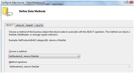
Let us go directly to an example to work with this control. The student class is the class to be used with an object data source. This class has three properties: a student id, name, and city. It has a default constructor and a GetStudents method for retrieving data.
The student class:
public class Student
{
public int StudentID { get; set; }
public string Name { get; set; }
public string City { get; set; }
public Student()
{ }
public DataSet GetStudents()
{
DataSet ds = new DataSet();
DataTable dt = new DataTable("Students");
dt.Columns.Add("StudentID", typeof(System.Int32));
dt.Columns.Add("StudentName", typeof(System.String));
dt.Columns.Add("StudentCity", typeof(System.String));
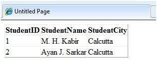
dt.Rows.Add(new object[] { 1, "M. H. Kabir", "Calcutta" });
dt.Rows.Add(new object[] { 2, "Ayan J. Sarkar", "Calcutta" });
ds.Tables.Add(dt);
return ds;
}
}
Take the following steps to bind the object with an object data source and retrieve data:
Create a new web site.
Add a class (Students.cs) to it by right clicking the project from the Solution Explorer, adding a class template, and placing the above code in it.
Build the solution so that the application can use the reference to the class.
Place an object data source control in the web form.
Configure the data source by selecting the object.
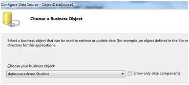
Select a data method(s) for different operations on data. In this example, there is only one method.
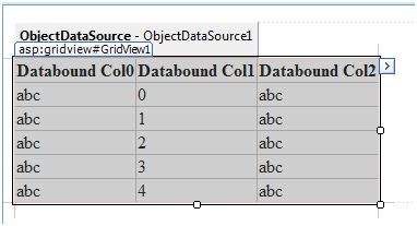
Place a data bound control such as grid view on the page and select the object data source as its underlying data source.
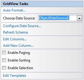
At this stage, the design view should look like the following:
Run the project, it retrieves the hard coded tuples from the students class.
The AccessDataSource Control
The AccessDataSource control represents a connection to an Access database. It is based on the SqlDataSource control and provides simpler programming interface. The following code snippet provides the basic syntax for the data source:
<asp:AccessDataSource ID="AccessDataSource1 runat="server"
   DataFile="~/App_Data/ASPDotNetStepByStep.mdb" SelectCommand="SELECT * FROM  [DotNetReferences]">
</asp:AccessDataSource>
The AccessDataSource control opens the database in read-only mode. However, it can also be used for performing insert, update, or delete operations. This is done using the ADO.NET commands and parameter collection.
Updates are problematic for Access databases from within an ASP.NET application because an Access database is a plain file and the default account of the ASP.NET application might not have the permission to write to the database file.


)
0 Reviews:
Post a Comment
If you have any doubts, Let me know, Please!